Picture this: You’ve crafted a stunning website with a sleek design and cutting-edge features. But something’s off. Users need to convert. What’s missing? The secret sauce is in your UX copy.

In the vast digital landscape, words are your silent salespeople, working tirelessly to guide, persuade, and delight your users. UX copywriting isn’t just about filling space – it’s about creating experiences that resonate, engage, and convert.
But what exactly is UX copywriting? It’s the art and science of crafting text for user interfaces that enhance user experience. It’s about creating a conversation with your users, anticipating their needs, and guiding them towards their goals (and yours) with carefully chosen words.
Ready to unlock the potential of your digital content? Let’s dive into ten real-world UX copywriting success stories that will inspire you to revolutionise your user experience. Each case study will show you how small wording changes can significantly impact user behaviour and conversion rates.
The Challenge: How do you create a campaign that speaks to millions of unique users while maintaining a consistent brand voice?
The Solution: Spotify's "Wrapped" campaign is a masterclass in personalised UX copywriting. Launched in 2016, this annual feature gives users a customised summary of their listening habits throughout the year. But it’s more than just data – it’s a story.
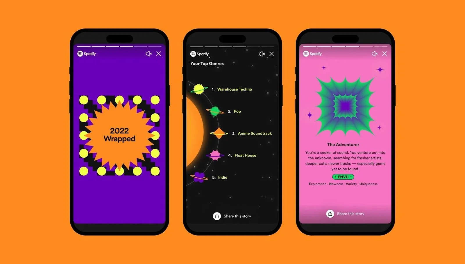
By crafting messages like "You discovered 423 new artists this year. Feeling curious?" and "Your top genre was ‘Indie Pop’. Sounds like you in skinny jeans!", Spotify turned dry statistics into engaging, shareable content. They used second-person pronouns to make the experience feel more intimate and included playful, conversational phrases that resonated with their largely millennial and Gen Z audience.
The Result: A staggering 21% year-over-year increase in mobile app downloads during the campaign’s first week in 2020. But the impact goes beyond just numbers. "Wrapped" became a cultural phenomenon, with millions of users eagerly awaiting and sharing their personalised stories on social media each year. It’s not just a feature anymore; it’s an event.
Key Takeaway: Don’t just present data – tell a story. Your users’ story. When done right, personalisation can create a powerful emotional connection with your audience.
Question: How could you incorporate personalisation into your UX copy to create a more engaging user experience? Think about the data you have on your users. How could you turn that into a compelling narrative?
The Challenge: How do you explain a complex service in a simple and compelling way?
The Solution: In 2015, Dropbox revamped its homepage to improve user understanding of its service. They ditched their vague "Your stuff, anywhere" tagline for a crystal-clear value proposition: "Keep your files safe, synced, and easy to share."
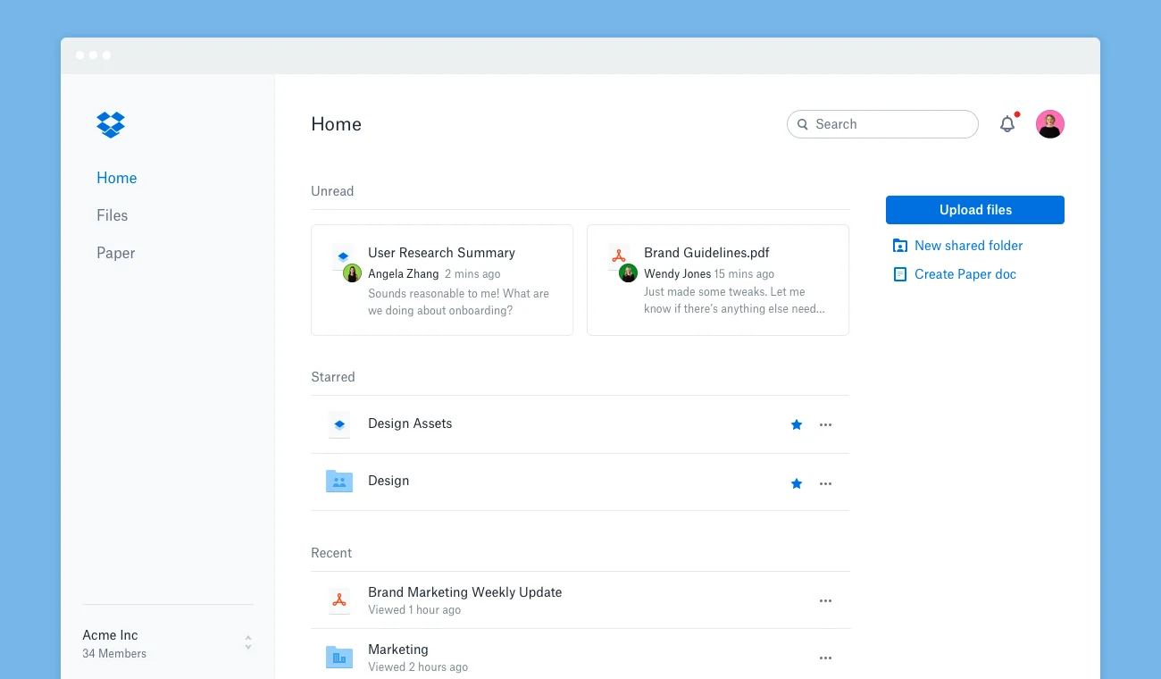
This new copy focused on benefits, not features, answering the user’s burning question: "What’s in it for me?" They broke down their service into three key benefits: safety, synchronisation, and ease of sharing. Each of these addresses a common pain point for potential users.
Moreover, they simplified their call-to-action buttons and reduced the amount of text on the page, making it easier for users to understand the service at a glance and take action.
The Result: A fantastic 10% boost in sign-ups. Not too shabby for a few words, eh? This increase translated to millions of new users for a company of Dropbox’s size.
Key Takeaway: Clarity trumps cleverness. Always. Don’t try to be too creative or clever when explaining your product or service. Instead, focus on communicating your value proposition as clearly and concisely as possible.
Try This: Look at your homepage. Can you explain your value proposition in 10 words or less? If not, it might be time for a rewrite. Remember, your users should understand what you offer and why it matters to them within seconds of landing on your page.
The Challenge: How do you guide users through a feature-rich platform without overwhelming them?
The Solution: Slack created an onboarding experience that’s as delightful as it is informative. They recognised that while their platform offers robust features, it could be intimidating for new users. Their solution? Break down the learning process into bite-sized pieces and infuse it with personality.
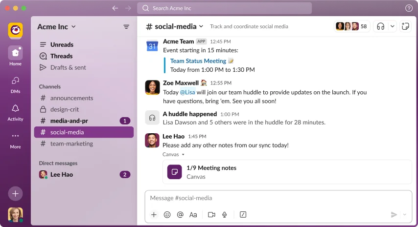
They used conversational copy like "Type a message to your team, then press Enter to send" to guide users through basic actions. This simple, action-oriented language makes even complex features feel approachable.
But what sets Slack’s onboarding apart is its personality. They sprinkled in surprise messages like "You look nice today" to keep users engaged and bring a smile to their faces. This approach turns what could be a dry, instruction-manual-style onboarding into a fun, interactive experience.
Slack also used progressive disclosure, introducing more advanced features only after users had mastered the basics. This prevents information overload and allows users to feel a sense of accomplishment as they progress.
The Result: An impressive 93% retention rate for trial teams. Now that’s something to chat about! This high retention rate indicates that users understood how to use Slack and enjoyed the learning process.
Key Takeaway: Feel free to inject personality into your UX copy. Users are humans, after all. A touch of humour or unexpected delight can turn a routine interaction into a memorable experience.
Challenge: Think of three ways you could add a touch of humour to your user onboarding process. Remember, it should fit your brand voice and resonate with your target audience.
The Challenge: How do you explain a versatile product simply and compellingly?
The Solution: Trello crafted a clear, benefit-focused headline: "Trello lets you work more collaboratively and get more done." This simple statement encapsulates the core value of the product – improved collaboration and productivity.
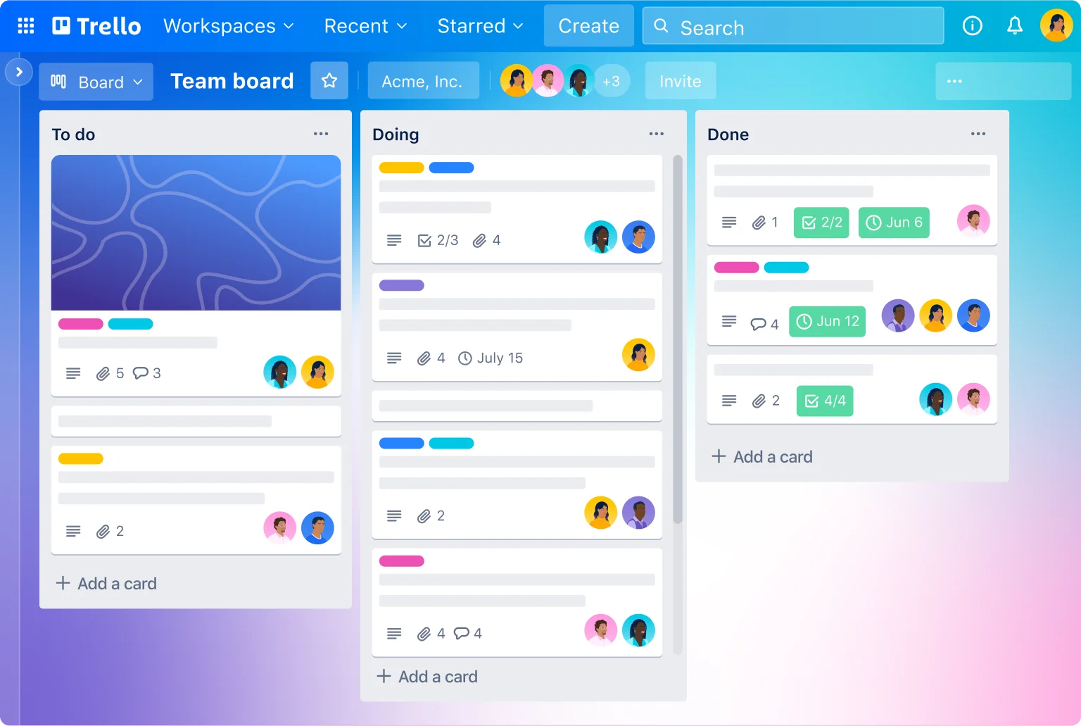
They followed up with concise benefit statements that explained how Trello achieves this: "Trello's boards, lists, and cards enable you to organise and prioritise your projects in a fun, flexible, and rewarding way." This gives users a quick overview of the product's key features and how they translate into benefits.
They also added social proof with a counter showing the number of users and organisations using Trello. This builds credibility and shows potential users that they're joining a large, active community.
The Result: A 2% increase in overall conversion rate. While this might seem small, for a company of Trello's size, it translated to thousands of new users.
Key Takeaway: Sometimes, the most straightforward message is the most powerful. Make sure to communicate your value proposition. Focus on communicating the core benefit of your product or service in clear, concise language.
Quick Exercise: Write three versions of your homepage headline, focusing on user benefits. Which one resonates most? Test them with your team or, better yet, with actual users.
The Challenge: How do you justify premium pricing and encourage upgrades?
The Solution: Evernote rewrote feature descriptions to focus on user benefits. Instead of listing "Web Clipper" as a feature, they described it as "Save web pages with a single click." This immediately communicates the value of the feature to the user.
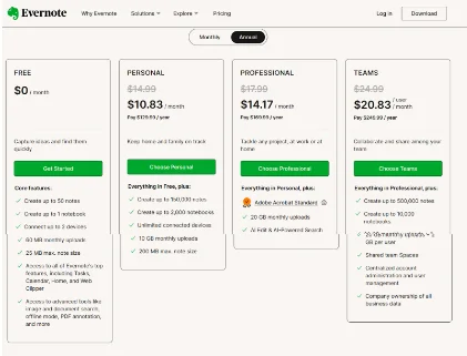
They used a clear hierarchy, listing the most valuable features first for each plan. This ensures that users see the most compelling reasons to upgrade right away.
They also added contextual tooltips to explain more complex features. This allows curious users to get more information without cluttering the page for everyone else.
The Result: A 10% increase in premium plan sign-ups. Looks like users found real value in those premium features!
Key Takeaway: Speak your users' language. Translate features into benefits they can relate to. Users don't buy features; they buy solutions to their problems.
Try This: Pick your top three features and rewrite them as user benefits. How does this change your perspective? Consider testing both versions with your users to see which resonates more.
The Challenge: How do you make your app irresistible in a sea of options?
The Solution: Duolingo led with a powerful value proposition: "Learn a language for free. Forever." This immediately addresses two key user concerns – cost and long-term access.
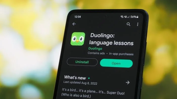
They followed with concise, benefit-focused bullet points highlighting the app's key features and advantages. For example, they mentioned the variety of languages available: "Learn Spanish, French, German, Italian, Russian, Portuguese, Turkish, Dutch, Irish, Danish, Swedish, Ukrainian, Esperanto, Polish, Greek, Hungarian, Norwegian, Hebrew, Welsh and English."
They also leveraged social proof by mentioning their "Apple iPhone App of the Year" award. This third-party validation adds credibility to their claims.
The Result: A 20% year-over-year increase in new user acquisition. Très bien, Duolingo!
Key Takeaway: Lead with your most vital selling point. Refrain from making users dig for it. In a crowded marketplace, you must quickly communicate why your app is the best choice.
Your Challenge: Rewrite your app's description in 50 words or less, focusing on your unique value proposition. What sets you apart from the competition? How can you communicate that quickly and clearly?
The Challenge: How do you simplify the sign-up process to increase new user registrations?
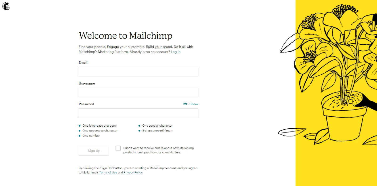
The Solution: MailChimp broke down the sign-up process into clear, manageable steps. They used friendly, conversational language, phrases like "Let's create your account" and "Tell us a bit about yourself." This approachable tone makes the process feel more manageable.
They also added reassuring microcopy beneath form fields, such as "We'll use this as your username" under the email field. This microcopy anticipates user questions and provides immediate answers, reducing uncertainty and hesitation.
The Result: A 14% increase in completed registrations. Simplicity for the win!
Key Takeaway: Guide users through complex processes with a clear, friendly copy. Break down multi-step processes into manageable chunks and use microcopy to guide the way.
Reflect: What's the most complex part of your user journey? How could you simplify it with better UX copy? Consider adding progress indicators or breaking the process into smaller steps with clear labels.
These case studies prove that in the world of UX, words wield incredible power. From Spotify's personalised year-end recaps to MailChimp's friendly sign-up process, each success story demonstrates how well-crafted copy can guide users, address their concerns, and motivate them to take action.
Let's recap the key lessons we've learned:
Remember, effective UX copywriting is always user-centric. It's about stepping into your users' shoes, anticipating their needs, and crafting resonating messages. It's about turning features into benefits, complexity into simplicity, and hesitation into action.
So, are you ready to revolutionise your UX copy?
Partnering with a skilled content writing agency in Mumbai can be a game-changer in crafting impactful UX copy. LexiConn, a leader in the field, stands out for its exceptional UX copywriting services. With a team of seasoned UX writers and a deep understanding of user experience principles, LexiConn elevates digital products by harnessing the power of words.
What sets LexiConn apart from other agencies is its comprehensive approach. They don’t just create copy; they dive deep into your target audience, product functionality, and brand voice. This ensures that every piece of UX content —from button labels to error messages—is designed to enhance the user experience while boosting engagement.
One of LexiConn's standout features is its focus on data-driven decisions. Unlike many content writing agencies, they don’t stop at writing copy. Instead, they continuously test, refine, and iterate based on user feedback and performance metrics. This commitment to evolving your UX copy alongside user behaviour ensures optimal results.
LexiConn’s team stays ahead of the curve, keeping pace with the latest UX writing trends. They masterfully blend clarity with creativity, crafting functional yet engaging copy. Whether it’s microcopy, onboarding flows, or a broader content strategy, LexiConn has the expertise to deliver standout results.
By collaborating with LexiConn, you're not just getting text on a screen—you're investing in a seamless user experience that delights, guides and converts. Their holistic approach to UX copywriting reduces friction, boosts engagement, and drives the success of your digital products. With LexiConn, your UX copy transforms from a challenge into a powerful asset.
I have read and accept the Privacy Policy
Read More