
Imagine you’ve spent hours creating a detailed report or writing a blog post, hoping it will grab attention and make an impact. But instead, it’s barely noticed, skimmed, or worse—ignored. It feels like all your hard work is wasted, doesn’t it?
Here’s the problem: people today are overwhelmed with information. They don’t have the time or patience to read long texts. So how do you make your message stand out and actually get people to engage with it?
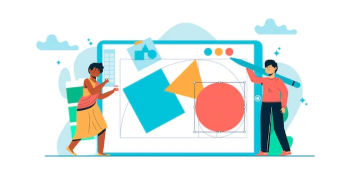
The answer lies in visual content—infographics and data visualization. These tools turn complex information into simple, eye-catching visuals that people love to share and remember. A good infographic can turn boring numbers into an exciting story, while a smartly designed chart can make your data easy to understand at a glance.
Want to connect with your audience in a powerful way? In this blog, we’ll show you how to use infographics and data visualization to enhance your marketing. Whether it’s simplifying statistics, presenting a process, or telling a story, these visual tools can make all the difference. Let’s explore how you can make your content not just seen—but remembered!
Humans are wired to process visuals more effectively than text. Studies show that 90% of the information transmitted to the brain is visual, and visual content is processed 60,000 times faster than plain text. This makes infographics and data visualization particularly effective for conveying complex information.
Visuals leverage the brain's dual-channel processing, which involves both visual and verbal inputs. Infographics and data visualization stimulate both pathways, making the content more impactful.
Example:
Explaining global warming trends through a line graph is far more effective than using a paragraph of text. The visual immediately communicates the rising temperatures and their implications.
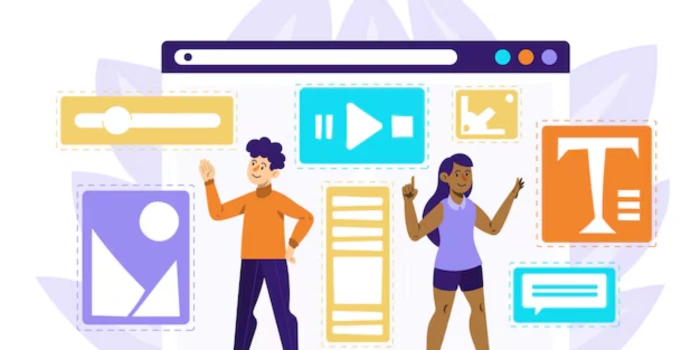
Infographics are versatile and engaging, allowing marketers to combine visuals and text to create compelling narratives. They can condense large volumes of information into an easy-to-follow format, making them a favorite for content marketers.
Statistical infographics present complex numerical data in a visually engaging way using charts, graphs, or percentages. They simplify information, making trends, comparisons, and insights easier for audiences to interpret and remember.
Example: Displaying a company’s yearly growth with bar charts effectively communicates performance metrics, aiding stakeholder understanding.
Process infographics illustrate step-by-step instructions or workflows in a clear and structured format. They help audiences follow sequential tasks or concepts, making learning or implementation straightforward and intuitive.
Example: A guide to setting up an online store breaks the process into visual steps, aiding beginners in navigating technical challenges.
Timeline infographics organize events or milestones in chronological order, providing a visual narrative. They help audiences grasp the progression of events or developments at a glance, enhancing storytelling.
Example: Showcasing a company’s history from founding to present builds brand identity and highlights achievements, fostering trust among stakeholders.
Comparison infographics emphasize differences or similarities between two or more entities. They are useful for decision-making by visually presenting pros, cons, or features side by side.
Example: Comparing organic and conventional farming practices highlights environmental and health benefits, helping audiences make informed choices.
List-based infographics organize information into bullet points or numbered lists, improving readability. They are ideal for presenting tips, benefits, or key ideas concisely and visually engagingly.
Example: "10 Benefits of a Balanced Diet" offers quick, visually appealing health tips for audiences seeking actionable information.

Data visualization involves representing raw data through visual elements like graphs, charts, and maps. This method simplifies complex datasets and highlights patterns, trends, and insights in an engaging way.
Bar charts are used to compare values across categories by displaying rectangular bars of varying lengths. They are effective for analyzing data patterns, differences, and distribution.
Example: Comparing monthly revenue across different regions provides insights into which regions perform better, guiding resource allocation and strategy development.
Line graphs depict trends over time by connecting data points with lines. They are ideal for showing gradual changes, patterns, or progressions across time periods.
Example: Monitoring website traffic growth after a marketing campaign reveals its impact and helps evaluate the campaign’s effectiveness for future improvements.
Pie charts represent parts of a whole, with each slice showing a percentage of the total. They are helpful for illustrating proportions and highlighting dominant segments.
Example: Displaying market share distribution among competitors visually emphasizes the leader and compares smaller players’ contributions.
Heat maps use color intensity to represent density or activity levels across a matrix or geographic area. They provide a clear overview of hotspots or areas needing attention.
Example: A heat map of website clicks identifies the most popular sections, guiding UX improvements or content placement strategies.
5. Scatter PlotsScatter plots display relationships between two variables by plotting data points on an X and Y axis. They help identify patterns, correlations, or outliers in datasets.
Example: Plotting ad spend against sales growth uncovers whether increased investment drives higher sales, aiding budget optimization.

Interactive visuals allow users to engage dynamically with data, providing the flexibility to explore specific insights by adjusting filters or parameters. These tools improve data accessibility and personalized analysis.
Example: An interactive dashboard enables users to filter sales data by region or time, making it easy to analyze performance trends and compare regions effectively.
Predictive analysis visualizes future trends based on historical data, helping organizations forecast potential outcomes and make proactive decisions. This type of visualization often incorporates machine learning models.
Example: Forecasting sales for the next quarter using line graphs allows businesses to plan inventory, marketing campaigns, and staffing needs with more accuracy.
Geospatial mapping uses geographic data to provide location-based insights. These maps help in understanding regional patterns, optimizing logistics, and enhancing decision-making for location-based strategies.
Example: Mapping customer locations to optimize delivery routes reduces costs, improves efficiency, and enhances the customer experience by ensuring timely deliveries.
Tailor visuals to the preferences and needs of your audience. For instance, create interactive infographics that allow users to input their own data to see personalized results.
Focus on StorytellingEvery infographic or data visualization should tell a story. Start with a problem, present data to explain it, and conclude with actionable insights.
Example: An infographic on climate change can begin with its effects, showcase data on CO2 emissions, and end with steps to reduce one’s carbon footprint.
Repurpose visuals across platforms to maximize reach. A single infographic can be broken down into slides for LinkedIn, posts for Instagram, and snippets for stories.
Leverage AnalyticsMonitor the performance of your visual content using metrics like engagement rates, time spent on pages, and shares. This data helps refine your approach for future campaigns.
Highlight Key Data PointsEnsure the most important statistics or insights stand out by using bold text, contrasting colors, or larger fonts to draw attention.
Incorporate Motion GraphicsAdd subtle animations or motion effects to static infographics for platforms like social media or websites, enhancing engagement and appeal.
Make It ShareableDesign your visuals with sharing in mind. Include social sharing buttons and make sure the format is optimized for easy sharing across platforms.
Add CredibilityCite sources for your data directly on the infographic to build trust and credibility with your audience.
Focus on AccessibilityEnsure your visual content is inclusive by using clear fonts, high-contrast colors, and alt text for visually impaired users.
Experiment with FormatsCombine data visualization with interactive elements, such as clickable charts or quizzes, to create a more engaging and immersive experience.

Overloading an infographic with excessive data confuses your audience and diminishes its impact. Focusing on one clear objective per visual ensures the message remains concise and accessible, making it easier for viewers to understand and engage.
Misleading visuals caused by improper scaling or cherry-picking data harm your credibility and audience trust. Using accurate data and ethical practices builds transparency and ensures your message aligns with the truth, fostering long-term credibility.
Neglecting accessibility in visuals excludes individuals with disabilities, limiting audience reach. Incorporating high-contrast colors, alt text, and screen-reader compatibility ensures inclusivity, allowing everyone to interact with your content meaningfully and effectively.
Cluttering visuals with excessive colors, fonts, or graphics can overwhelm and disengage your audience. A cohesive design theme with a balanced color palette and minimalistic elements ensures visuals are professional, appealing, and easy to comprehend.
Creating visuals without understanding audience preferences risks irrelevance and disengagement. Researching their demographics, pain points, and needs helps craft tailored content that resonates deeply and strengthens emotional and intellectual connections with your viewers.
Visuals that aren’t adapted to platform-specific dimensions, formats, or resolutions appear distorted or ineffective. Optimizing visuals for each platform ensures they retain quality, engage viewers, and perform seamlessly across different devices and channels.
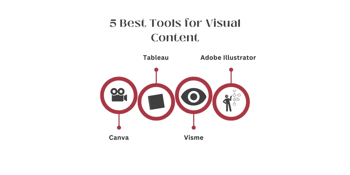
Canva is an intuitive design platform, ideal for beginners looking to create professional-looking visuals without advanced skills. It offers pre-designed templates for infographics, social media posts, presentations, and more. With its drag-and-drop interface, users can easily customize layouts, colors, and fonts, making it perfect for quick, eye-catching content creation.
Tableau specializes in data visualization and business intelligence. It allows users to build dynamic, interactive dashboards that can integrate real-time data from multiple sources. Known for its robust analytical tools, Tableau helps users uncover trends and insights, making it essential for professionals looking to present data in visually compelling ways.
Visme is a versatile design platform that bridges presentation design and infographic creation. It offers templates, charts, graphs, and animations, enabling users to create visually stunning content for marketing, education, or business. With a focus on simplicity and customization, Visme makes it easy to craft impactful visuals tailored to specific audiences.
Adobe Illustrator is a professional vector-based design tool favored by advanced users. It provides unmatched precision for creating custom infographics, logos, and illustrations. With powerful features like advanced typography and scalable graphics, Illustrator is perfect for detailed, high-quality visual content that requires a creative and polished touch.
Power BI by Microsoft is a comprehensive tool for data analytics and visualization. Designed for businesses, it enables users to analyze large datasets and create interactive, shareable dashboards. Its ability to connect to various data sources and generate actionable insights makes it indispensable for teams seeking to drive data-informed decisions.
Evaluate likes, shares, and comments to understand how well your visual content resonates with the audience, sparking interactions and conversations about your brand. Tools like Hootsuite can track engagement metrics across social media platforms effectively.
Traffic SourcesTrack where your audience comes from—social media, search engines, or direct links—to measure how effectively your visuals attract visitors. Use Google Analytics to gain insights into traffic sources and audience behavior.
Conversion RatesMonitor the percentage of viewers who take desired actions, like downloading a resource or completing a purchase, to assess your visuals' effectiveness. Tools like HubSpot provide comprehensive conversion tracking and reporting features.
Time on PageMeasure how long users stay on a page featuring your visuals. Extended time reflects engaging and compelling content. Platforms like Crazy Egg offer tools to analyze user behavior and time spent on pages.
At LexiConn, we transform your brand's vision into compelling visual stories. Our dedicated team of seasoned writers and designers works collaboratively to deliver content that not only catches the eye but also drives engagement and results.
We blend captivating design with strategic communication to create visuals that engage and drive results.
🔹 Expertise You Can Rely OnOur team of skilled writers and designers delivers professional, impactful content tailored to your brand.
🔹 Versatility Across ProjectsFrom social media graphics to full-scale marketing campaigns, we handle it all with precision and creativity.
🔹 Trend-Forward Yet TimelessWe balance current design trends with timeless appeal to ensure your content always stands out.
🔹 ROI-Driven ApproachOur designs merge creativity and business objectives, ensuring measurable returns for your investment.
Infographics and data visualizations help brands stand out in a crowded digital landscape. Adopting best practices, understanding psychological principles, and leveraging advanced tools will ensure your visual content resonates with your audience, driving both engagement and results.
At LexiConn, we make complex ideas easy to understand and help your brand connect with your audience. Let us turn your data into visuals that grab attention and get results. Contact LexiConn today or book a free consultation.
I have read and accept the Privacy Policy
Read More