User experience (UX) design and copywriting are components that collaborate closely to create a captivating interaction between a product and its users. UX design is concerned with how users engage and navigate through a product experience, while UX copy plays a role by offering the necessary words of guidance and emotional cues that impact user behavior.
Given the importance of words in shaping user behavior, how can you determine if your UX copy performs well? It is where A/B testing comes in.
It is a wonderful tool for optimizing UX copy. By comparing two webpage or app variations, you can gather data-driven insights about what resonates best with your audience. This blog will explore using A/B testing effectively to improve your UX copy, enhance conversion rates, and create a better user experience.
A/B testing implies comparing two versions of a webpage, app interface, or specific element (like a button or headline) to determine which performs better. In the context of UX copy, it means testing different variations of your text, whether a headline, a call-to-action (CTA), body text, or microcopy.
For example, Version A might have a CTA button that says, "Get Started," while Version B says, "Start Your Free Trial." Both versions are shown to different segments of your audience, and based on user actions—clicks, conversions, sign-ups, etc.—you can determine which one performs better.
UX copy may seem like a small part of the overall design, but the right words can significantly impact user behavior. The words you choose can influence how users feel, their actions, and whether they continue to engage with your product or service.
A/B testing enables you to:
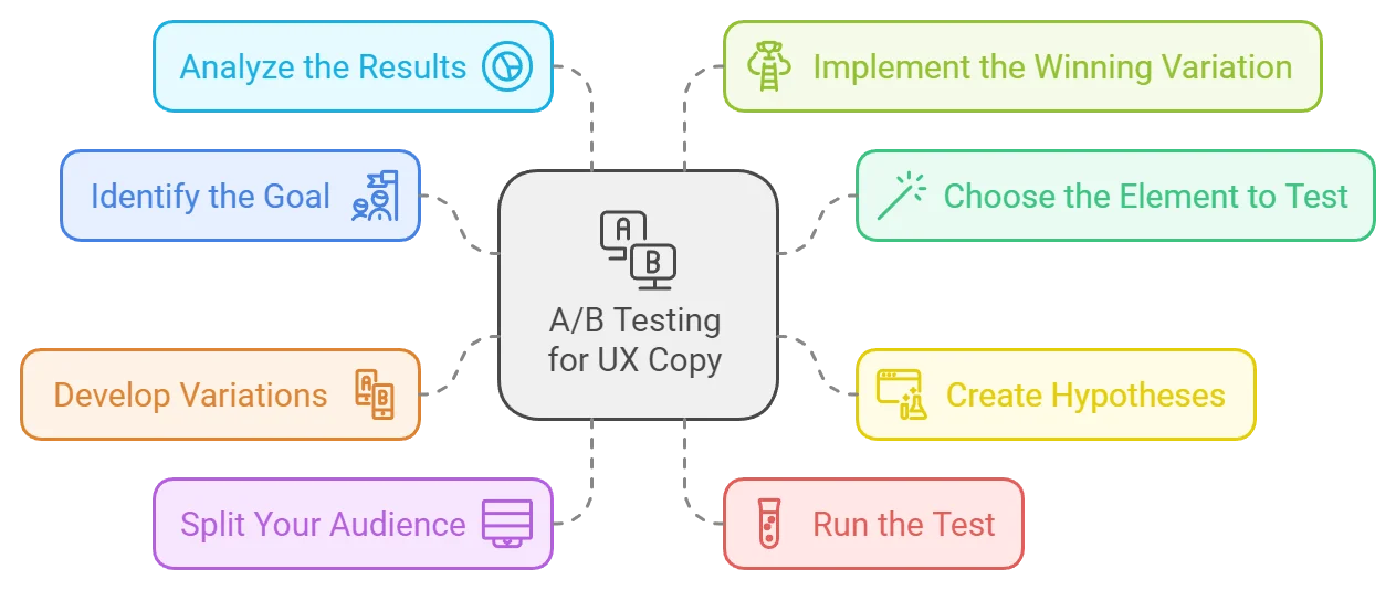
Let's break down the steps to use A/B testing to optimize your UX copy effectively.
Before you begin any A/B test, you must identify your goal. Your goal will determine the type of UX copy to test and how you measure success. Common goals for UX copy optimization include:
Example: If your goal is to increase sign-ups, your A/B test might focus on the copy in the sign-up form, CTA button, or headline.
Once you've set your goal, you must decide which part of your UX copy to test. Here are some key areas you might consider:
Next, form a hypothesis based on what you believe will improve user experience or conversions. A good hypothesis follows this structure:
Example Hypothesis: "By changing the CTA from 'Get Started' to 'Start Your Free Trial,' we predict that more users will click through and complete the sign-up process."
Now it's time to create the variations of your UX copy that you'll test. Let's say you're testing a CTA button. You might develop two variations like this:
Make sure to test only one variable at a time. If you're testing the CTA, keep all other elements (such as the design or placement) the same to ensure that any differences in performance are attributed to the copy alone.
To conduct an A/B test, you must divide your audience into two or more groups. Each group will see a different variation of your UX copy. These groups should be split randomly to ensure unbiased results.
Once your test is live, it's time to let the data roll in. Depending on your traffic and the test's significance, this phase may take anywhere from a few days to a few weeks. Make sure to run the test long enough to collect sufficient data.
After running the test, analyze the performance of each variation. Some key metrics to focus on include:
Conversion rate: Did more users complete the desired action with Version A or B?
Click-through rate (CTR): Which version led to more clicks on the CTA?
Bounce rate: Did one variation keep users on the page longer?
Use statistical analysis tools (many A/B testing platforms like Optimizely, Google Optimize, or VWO offer this) to determine whether the differences in performance are significant or just random variations.
Once you have enough data to determine the better-performing variation confidently, it's time to implement the winning UX copy. But don’t stop there. UX optimization is ongoing, so you can continue running A/B tests to refine and improve your copy over time.
Examples of UX Copy A/B Testing in Action
A company wanted to increase conversions for its free trial sign-up. Initially, their CTA said, "Get Started." They hypothesized that a more specific offer might encourage more users to take action. They tested the following variations:
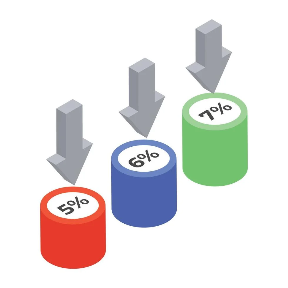
Result: Version B saw a 20% increase in sign-ups, confirming that the added clarity and perceived value of the offer made a significant difference.
A company noticed high abandonment rates on its sign-up form. They tested the microcopy in the email input field. The original placeholder text said, "Enter your email." The new variation said, "We’ll never spam you."
Result: The variation with the reassurance about privacy increased form completions by 15%. It shows how microcopy can alleviate user concerns and improve overall experience.
A website had a generic error message for users who entered incorrect credit card details: "Payment could not be processed." They hypothesized that providing more specific guidance could help users correct the issue faster. The new error message said, "Please check your card number or try a different payment method."
Result: Users were able to resolve the issue faster, reducing cart abandonment rates by 10%.
Best Practices for A/B Testing UX Copy
To avoid confounding results, test one element at a time. If you change both the headline and the CTA, you won’t know which change was responsible for any differences in performance.
Ensure the variations you test represent meaningful differences. Changing "Sign Up" to "Sign-Up" with a hyphen will unlikely yield significant results. Instead, focus on testing variations that impact tone, messaging, or value proposition.
Small samples do not usually give appropriate results. Make sure your test runs long enough to gather sufficient data. Many A/B testing tools provide calculators to help determine the required sample size.
Avoid running sequential tests where one group sees Version A in the morning and another sees Version B in the evening. External factors (like time of day or week) could influence user behavior, skewing the results. Instead, split your audience so both versions are being tested simultaneously.
A/B testing is not a one-time process. Even after identifying a winning variation, continue to test new ideas. The more you experiment, the better you understand your audience and optimize the UX copy accordingly.
Common Pitfalls to Avoid
Testing random changes without a clear hypothesis can lead to inconclusive results. Always start with a solid hypothesis explaining why you think one variation will perform better.
Stopping a test once you see positive results can be tempting, but premature testing can lead to inaccurate conclusions. It is wiser to let the test run longer to gather essential data.
External factors, such as seasonal changes or promotions, might impact the test results. For instance, an A/B test run during Black Friday might perform differently than one run during a normal week. Consider these factors when analyzing your results.

A/B testing is the most effective way to optimize UX copy and enhance user experience. By testing variations of your headlines, CTAs, and microcopy, you can gain valuable insights into how different wording impacts user behavior. With data-driven decisions, you can optimize your copy for higher conversions, better engagement, and a smoother overall experience. Clear goals and hypotheses must be set to carry out successful A/B testing. Testing one element at a time and refining the method consistently is advisable. Through ongoing experimentation and analysis, you’ll unlock the full potential of your UX copy and create a more effective digital product.
To improve your UX strategy further visit the Lexiconn website for a wide range of resources available there! Also think about setting up a 30-minute free consultation, with our specialists to chat about customized strategies that suit your requirements.

I have read and accept the Privacy Policy
Read More